Caryn Corenblum, owner of IntuitivEdge Coaching and Learning, came to me with a common request. She had a logo she liked, but did not love, and a website that was functional but not her “style”.
Caryn is a spirited and vibrant woman with big smile and a bigger heart. Caryn’s heart and soul have found their home in coaching others to fulfill their own personal destiny. “My biggest joy comes from assisting others in unleashing their thinking to create exceptional lives,” states Caryn — and that she does. But her marketing wasn’t saying it clearly and powerfully.

Caryn’s original tree logo
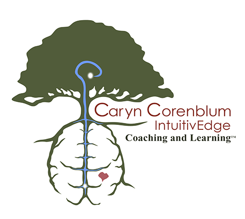
When her business began to take off, Caryn felt it was time to dust off her marketing materials and tweak them to create something that reflected her style and business personality. We started with her mark. Caryn’s original logo featured a tree. She was fairly happy with the logo, but because Caryn’s work is so involved with neuroscience, Caryn wanted the logo to reflect that science. We looked at what she had and talked about branches of a tree and the branches of neural pathways in the brain and decided that was where we would make the connection.
Caryn also felt strongly about not only presenting the neuroscience side but also also a warmth and connection to personal truth, from inner knowing to the brain. We decided that the use of a small heart connected to the brain’s firing imagery added just enough warmth.
We worked through a number of styles and Caryn was able to guide us to a perfect fit with her likes and dislikes of our various iterations of the IntuitivEdge logo. We settled on the version you see here. While the initial impact of the logo is warmth and growth, the scientific neural connection remains the underlying message.
With the logo taken care of and letterhead and business cards developed, it was time to take on Caryn’s web presence.

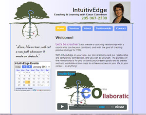
Caryn’s site before the reskin
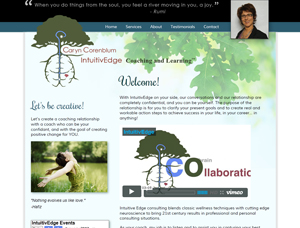
Deluxe Interactive Services decided to limit our development work to a reskin for her current working site. The site worked fine and had some good information. Caryn has a lot going on and doesn’t spend a lot of time on the internet, so a content management system would be overkill for her right now. What was lacking and what she did need was a fresh coat of paint. The warmth and polish that both Caryn and her marketing materials reflected was just not there.
We presented Caryn with three mock-ups based on her current marketing materials and aesthetic leanings. She again guided us as we reviewed the mock-ups. We took her input and reworked the three into one.
Because Caryn had a deadline of the publication of an interview in the Over the Mountain Journal, DIS vowed to Caryn and ourselves to get this reskin done before the article landed in readers’ hands. We burned the midnight oil on this one but were happy to do it. Caryn is the kind of client we love to work with: Open, friendly, honest, and truly about making the world and her clients’ lives a better place. We are happy to serve!
We’ll be expanding Caryn’s presence in the future but we’ve got her up and running with a logo and a site she, and DIS, can be proud of!


